CASE STUDY // BRAND DEVELOPMENT
Retool or overhaul?
Realigning a company’s visual identity to reflect an evolving brand
Memora Health is a digital health company focused on connecting and simplifying the care journey for patients and providers. Their platform allows care teams at large healthcare organizations to seamlessly manage and communicate with patients through the course of their medical treatment, thereby improving patient outcomes.
At the time, Memora’s visual identity was not reflective of their current-day values, offerings, and differentiators. Memora also needed a design system that could be easily and consistently used across the organization. A flexible, clear toolkit would enable teams to build the brand through consistent, replicable visual themes across all channels.
Our approach
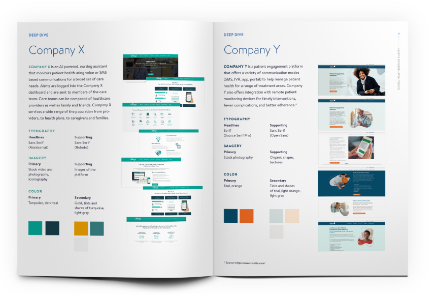
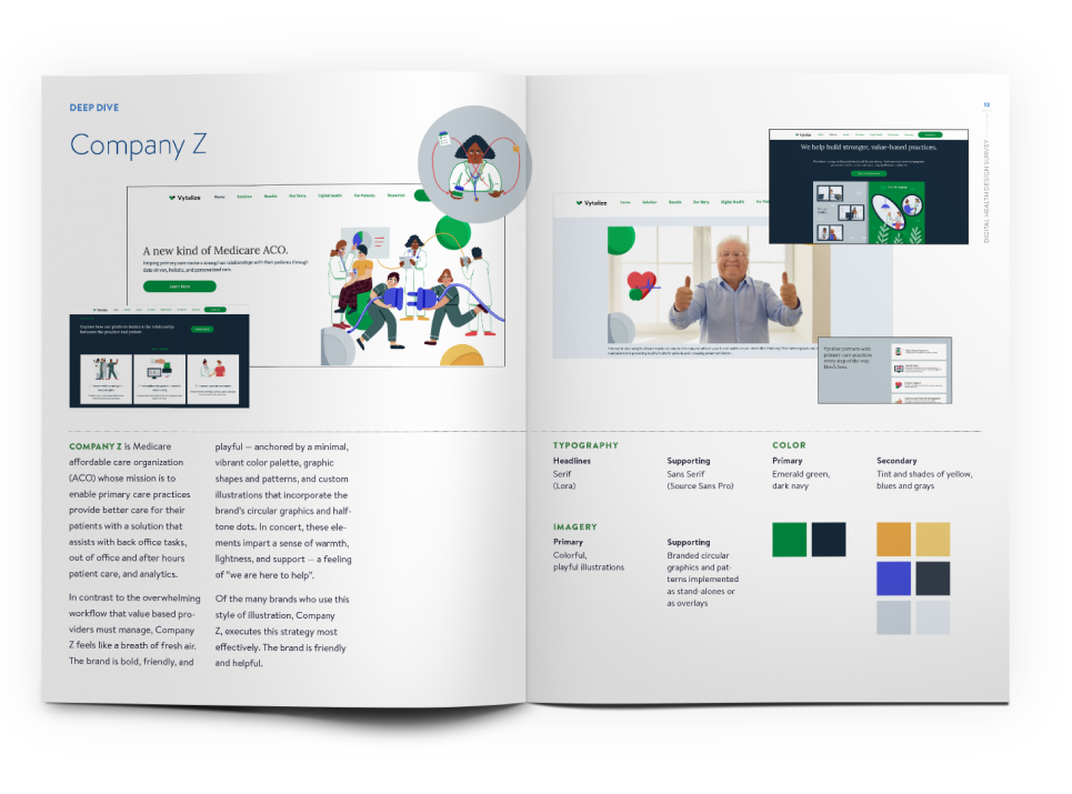
We started the brand strategy work by auditing the visual design of direct competitors as well as the digital health community as a whole. This allowed us to get a pulse on how the industry engaged with stakeholders. It also helped us gain clarity regarding areas of opportunity surrounding Memora’s existing brand. This exercise shifted the conversation from personal preference-based brand design to strategy-based objectives and how to achieve them.
BRAND PERSONA MAPPING
& PERSONA MAPPING
DEEP DIVES
A close study of competitors and market adjacent companies and their branding
Our findings & recommendations
Our research supported retooling versus a complete overhaul of the brand to better reflect key company values (flexibility, accessibility, and inclusivity).
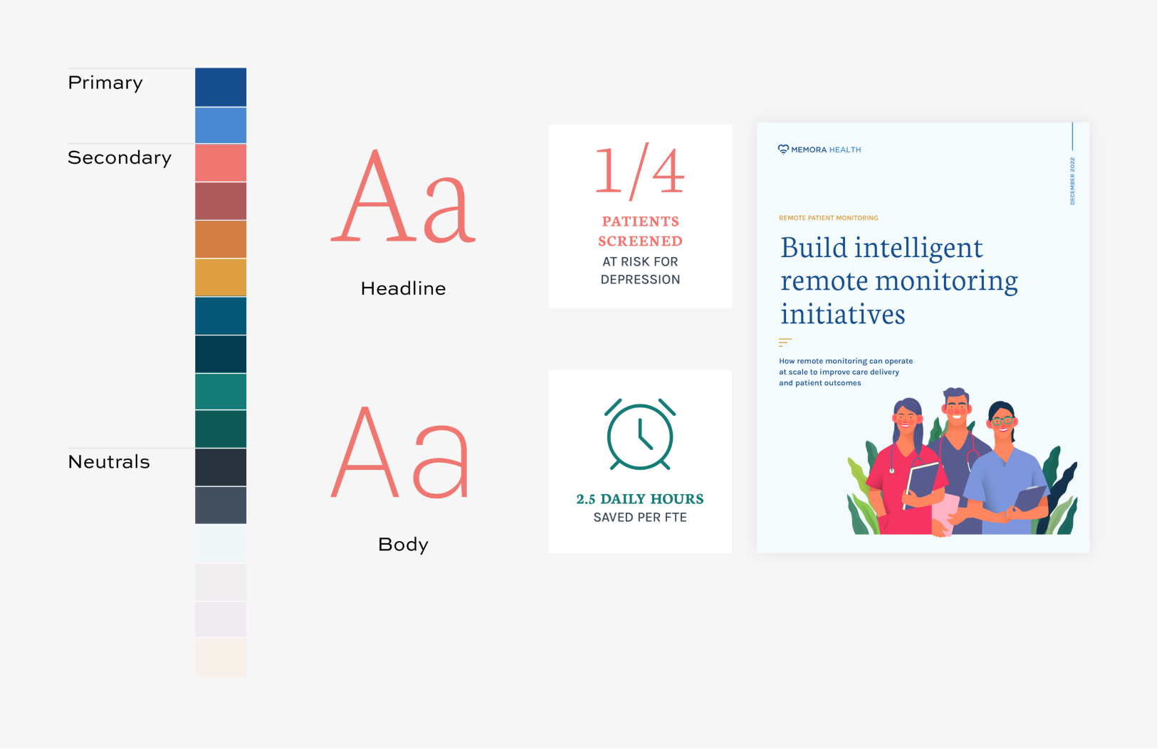
We presented two alternatives, including detailed suggestions on typography choices, comprehensive color palettes, imagery/illustration options, and usage recommendations and examples.
01
ILLUSTRATION STYLE
Warm, accessible, helpful
COLOR & TYPOGRAPHY
Guidance with sample usage. Additional detailed usage notes provided.
02
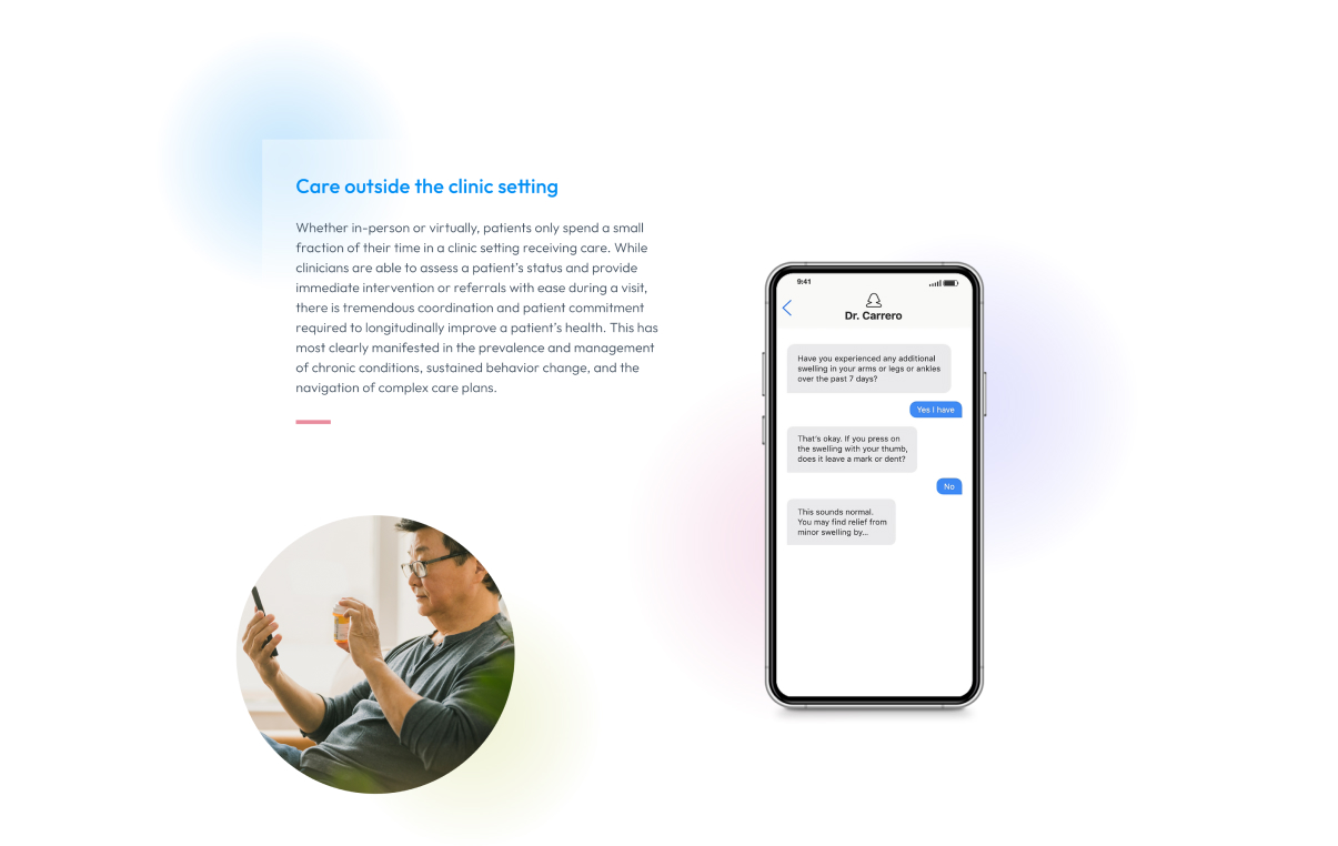
IMAGERY
Relatable, clear, vibrant
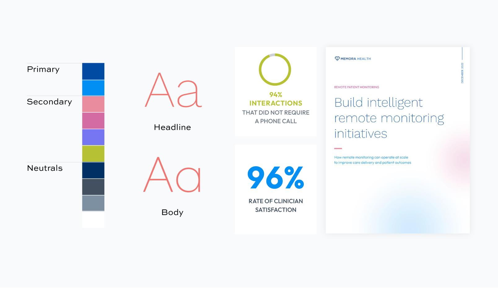
COLOR & TYPOGRAPHY
Guidance with sample usage. Additional detailed usage notes provided.
Our impact
Our audit and strategy work enabled Memora Health to view the branding work from a wider lens. This research enabled us to integrate our findings with the values and vision of the organization. Memora implemented our brand strategy recommendations and now has a modern, forward-thinking visual design that supports their shift to a seasoned partner and leading innovator in digital health.
The team expressed great pride and ownership in the refreshed brand and now have one consistent, visual voice across all internal and external communications.
The Create Forward team impressed us from the start.
They quickly understood what we were trying to accomplish with our brand refresh project, helped us define our strategy & goals, and kickstarted the work so we could rapidly get our new vision out in the market
Omar Nagji
Chief Operating Officer
MEMORA HEALTH